Tag Archive for: infographics

Why influencer marketing is the future of content

In many posts have we written about the relevance of influencer marketing and how it differs from the value of brand advocates. Today, many marketing organizations and brands have understood the power of influencer marketing and dedicate a significant amount of their budget to them. And there are good reason for it which we can see from one of the latest infographics in the market provided by the guys from The Shelf.

Shoppers trust in influencers and use them as their third-most-consulted consumer decision information source. Although brand and retail sites are still in the lead as an information source. Blogs already come in right after them, even ranking higher than well-trusted social networks like Facebook, YouTube, Pinterest, Twitter and Instagram.

Years ago, we have made clear that the 3 Rs of the social consumer will be leading the decision making process in the future: ratings, reviews and recommendations. The infographic is another proof for our thesis those days. These days, influencer are more trusted than brand content where recommendations have got the biggest power with 92% of consumers trusting in those. Reviews have become the second most trusted source (70%). People also try to stay on top of thought leaderwith blog content that is consulted by 47%.

Although the opportunities are there, only two out of three marketers (65%) invest in influencer marketing so far. and every second company separates their budgets for sponsored social content from other budgets (52%). Still, the amount of investment is not “nickles and dimes” anymore for brands and companies. Every fourth company already spends over $500,000 already.

Spot On!
Why influencers play an important role inside your content strategy is obvious. They can explain products from various subjective and objective angles. They can play an important role in your community management when negative input needs tob e turned into positive arguments. They can have a big impact in your content production strategy in having an external view on your business and relevance in the market, and thus become your „search-engine-optimizers“. And, they will play a significant role in your sales approach if you take your time to think about it (or maybe talk to us if you don’t have an answer).

Have a look at the infographic and decide yourself if and how you would like to use influencer marketing in the future.

TheShelf-Influencer-Marketing-Infographic-2015

The YouTube revenues (and more) in a minute (Infographic)

The guys at YouTube Downloader Blog have created a very interesting infographic. Where they have recently explained why Saudi Arabians are the most engaged YouTube viewers in the world, this new infographic shows us the YouTube world in one minute in order to reveal what happens during 60-seconds on the world’s leading video sharing site.

The infographic shows the amount of video uploaded to YouTube each minute and gives insights in the ad revenue that the site’s top channels generate in that minute. Thus, we get to know that PewDiePie earns more than $13 a minute.

According to the infographic, YouTube generates more than $10,000 in revenue per minute. A figure that is base on the site’s estimated annual revenue of $5.6 billion, which means over $14 million of revenue each day.

Youtube-In-A-Minute

Study shows, how B2B decision-makers consume vendor content

Some weeks ago, we spoke about a study that described what B2B decision makers expect to read on vendor websites. Now, a new study of 352 buyers (predominantly large businesses) from The CMO Council and NetLine shows that the majority of organizations (94%) favors to curate and circulate relevant content in their organization before finally deciding to purchase B2B solutions and services. For years, marketers thought B2B buyers and influencers alike are simply using vendor-related content from time to time.

The study makes clear that there is no real sharing structure to be made out from company to company. However, there are three main patterns that the study highlights in their results:
From the Middle Out (35%): Execution-level executives search and find content about vendors/products and make the purchase. Senior management gets educated thorugh them why the decision was made.
From the Bottom Up (30%): Junior or mid-level employees find vendor-related content and share their discoveries with senior management. Then they make the final decision.
From the Top Down (29%): Senior managers find the content, then share it with lower-level managers for analysis and final purchase.

CMO Council Netline B2B content sharing

The same as with the sharing patterns, there are three key personas within the businesses who act according to their own behaviors, expectations and needs.
Researchers: Primarily focused on new industry reports/research to inform them of advancements in solutions, trends affecting the markets, and opportunities for improvement.
Influencers: Interested in both thought leadership found in trusted third-party channels and vendor-branded technology specifications, data sheets, and use cases. Their special interest is in summarized content, i.e. infographics, videos, and blog comments.
Decision-Makers: Want to stay informed through broad research reports and analyst commentary. However, they expect to have access to detailed data to enable better decision-making at the tail end of the purchasing funnel.

Spot On!
The study reveals some further interesting insights. The vendor selection is major to moderate influenced by online content, find 88% of the B2B buyers and more than a third (38%) find that online content provides strategic insights and shapes the purchase decision. The content that is valued the most is research reports and studies (65%), technical spec and data sheets (50%), analyst reports (46%), whitepapers (35%) and posts on trade publishing sites (30%). The power of Google and the vendor website comes out as well: When more than two third state they start their vendor-related content sourcing with search engines and portals, it shows that the best training the marketers is to read the two B2B studies and draw some conclusion out of it for the future of your own content, PR and marketing acitivites. And if you cannot find a solution, we are happy to help…

Content: Secrets of a killer blogpost (Infographic)

Many marketing, PR or product managers think about starting their own blogs when joining one of our inhouse or open seminars. And for most of them, it has become a challenge just finding the right topic that makes them outstanding with their product or service offering. This is not surprising, bearing in mind that there were already 74.874.233 WordPress websites out there when I wrote this post – and when you think about Blogger, Typepad, Tumblrs and all of those enterprise blogs, it becomes a mission impossible to find a niche that helps building brands.

Now, the guys at WhoIsHostingThis.com have published some helpful infographic which give us some quite good arguments on what matters when you start blogging.

Which Content?
There is no magazine without a smashing title. Ideally, you write about the topics you are an expert in. As people will want credible, meaningful and authentic blog posts, this is the only way to get your readers attention. Then, check out what readers do want, discuss and share on your topic via social media monitoring. This will make your content interesting and will prevent you from writing content that nobody reads.

Original or Curated?

If you have got the time to write original content, go for it. It’s the best for your reputation and shows your own mindset. And most importantly, Google likes original content which is more likely to rank better. Whenever, there are guest bloggers who want to contribute to your website, invite them.
However, the truth is that if you curate your competitor’s content or third party content from time to time (with a back link!), you jump into their fish-bowl. The easiest bit is if you use their infographics, webinars and branded industry blogs to expand their ideas and thoughts.

Consistency? 

Find your style and stick with it. People want to feel “at home” and comfortable. Figure out when most people share your updates, or when it’s better not to send them live. If you can afford it, stick to an editorial calendar as people love publishing source they can rely on finding the relevant set of information that stands out.

Good luck (and if you need help), we are here to advice…

How-to-Write-a-Successful-Blog-Post

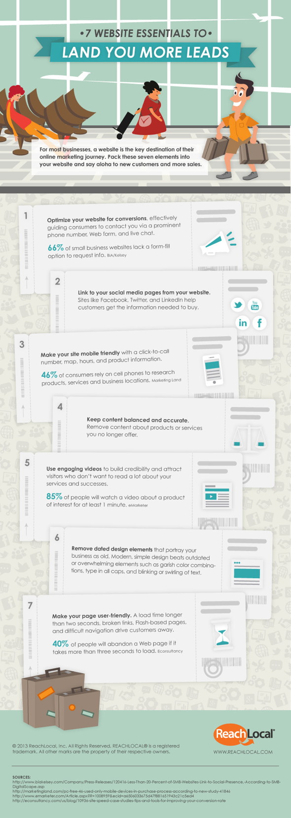
7 Tips: How to generate more sales leads via your website

There are some secrets in online marketing, and there are those that have become common knowledge which people might spread in infographics. However, it is still a challenge for most marketers to detect those inbound marketing insights that simply come from the structure and content of a website. If you as a marketer are looking to increase the data you generate through your landing pages, this infographic might offer some more food for thought.

Whether you know what it means to create a user-friendly website structure, a clever banner campaign to get more potential customer data, or not. Reach Local states in their advice that almost half of the users come to research your service or products via the mobile website. So, did you ever invest in a mobile-friendly website? Or have you ever thought about a video and the time people invest to watch it? Often you loose a sales pitch in 10 seconds but according to the infographic your clients might spend 60 seconds at least to watch a video about your product or service.

Check out which of the seven hints might help you drive more leads through to your sales team.

And, whether you believe it or not, there are three more hints in this text that might foster lead generation for The Strategy Web. If you have found them, share them with a comment below. If not, get in touch and we will help you.

Reach-Local-Seven-Website-Essentials-land-For-More-Sales

InMobi Global Study: Mobile media consumption outpacing TV, mobile ads drive sales

In prepapration of the first dmexco Night Talks moderation in Hamburg on “Mobile: The new first screen: reach, engage, measure, monetize”, sometimes studies fly into my mailbox which are reaching me just at the right time.

InMobi released their second wave research report on Mobile Media Consumption at Mobile World Congress. It covers some on-going overview on 14 countries on how we consume mobile content these days, and it obviously underlines the rapid growth of mobile media and the benefits of mobile advertising around the globe.

From a global perspective, mobile has reached the sweet spot in media consumption. It will generate its growth in the coming year predominantly via social media, search/download apps and search activities. In the 14 countries, humans spent from 7 hour media consumption (apart from other channels)…
1. Mobile 1,8 hours
2. PC 1,6 hours
3. TV 1,5 hours

The research piece shows that 50% of the average global mobile web users primarily use their mobiles now to go online. The average mobile web person uses 6.5 apps throughout a 30-day period.

But what does this mean for marketers?

The study states that globally, 54% of users discover mobile ads via apps, 40% on a search engine, 27% on a retailer website and 23% on a video website. It also makes clear that mobile is the touchpoint for finding new products and services. 3 out of 4 say mobile advertising has opened doors to something new. Almost every second say mobile ads have influenced them to buy mobile (46%) and almost the same amout (45%) say that mobile has mobile ads have influenced their purchase decision.

When seeing mobile ads, it is not that users don’t take any actions. It is actually the other way round. Mobile ads let users downloaded an app (80%), visit the advertiser’s website (67%), visit the store/retailer/business for additional information (52%), locate an advertiser on map (45%), or even take an immediate phone call (37%).

Mobile Media Consumption InMobi 2013

Spot On!
While I still have some marketers from media houses and brands in my ears, saying that apps and mobile ads don’t seem to be the right marketing approach, it seems they just did not find the right content approach to their users. The mobile commerce world is growing at speed of light and innovative retailers and brands should be well-prepared for it – and ideally have at least a click-to-call solution on their mobile website. It is not surprising that in these 14 countries 80% retailers say they plan to get the right approach to mobile in 2013.

How about you? Are you prepared for the mobile sales and marketing development? What experiences do you have so far with mobile ads?

PS: If you are interested in attending the dmexco discussion in Hamburg, please book your seat here.

Social Media Evolution at EMC (Video)

Many companies have started showing case studies, infographics, or videos to present their latest Social Media activities. Now, EMC comes up with a great video that explains nicely how the copany leverages the power of the social web.

In a “comic-style” video a Neanderthal man (what a nice metaphor) explains how Social Media has changed the way EMC engages with its audiences, how it helps to strengthen their relationships with customers and partners, and the public. However great all their success might be, they also highlight the responsibility which comes along with the Social Web engagement.

The EMCCorp YouTube channel states that the “brief training video is designed to communicate the key points of proper social engagement while not losing sight of the ‘fun’ side of Social Media”.

I remember a social media training day I have given their marketing team about one year ago and how much they liked the power of virals I have shown them. Don’t know if this can be connected to the training, but I have to ask… Isn’t this a nice way to illustrate the social media evolution in the business arena? Well done, EMC!

PS: Some bits and pieces in the video could be discussed from a social media strategic perspective as I would not always agree with them…

YouTube

By loading the video, you agree to YouTube's privacy policy.
Learn more

Load video

Update 2011: Social Media Revolution Version 3

It has become a classic for all social web evangelists in the last three years. Now, we have version number 3. I am talking about the videos called Social Media Revolution (versions number 2is here). Those videos that tell us the story how the social web changes and takes over our offline world. If you believe it or not…

Last week, I have written about how fast the social web is changing the world in only 60 seconds. With this video we get some more data. And again, I will be raising the question if we understand the challenge of reading infographics properly from a business perspective. However, I am sure I will see this video again in many presentations in the next months.

This latest version contains the data and statistics as of June 2011. All Social Media Revolution videos were created by Eric Qualman from Socialnomics.

YouTube

By loading the video, you agree to YouTube's privacy policy.
Learn more

Load video

What happens in 60 seconds on the Social Web? A comparison and the value of "infographics"…

There are different ways to illustrate how fast the Social Web is growing these days. For two years my favorite “real-time” resource -based on studies and research data- was Gary Hayes Social Media Count. And I am sure, you have all seen this great little widget already…

However, we also have to keep up with the pace and realize that -although people already hate them- infographics are sometimes a nice way to grab facts quick and easy. The Shanghai Web Designers created an infographic which illustrates how fast conversations, comments and content are produced on social networking and online platforms in only 60 seconds.

60 Seconds - Things That Happen On Internet Every Sixty Seconds
Infographic by- Shanghai Web Designers

Now, although I honor the work of the Shanghai Web Designers, it lacks some information on where the data was generated from. Gary Hayes explains nicely how the app data was put together and how actual it is (having said that I think Gary needs to refresh his links as I found links ending in 404’s).

A comparison could be interesting, I thought. Why not compare the 60 seconds data from the Shanghai Web Designers (SWD) versus a “one-minute-momentum” of Gary Hayes (GH) counter…? I started the counter and waited 60 seconds, and there you go. Here are the results…

The comparison will just focus on the essentials Google, Email, Facebook, Twitter and Youtube. You can still do your own comparison afterwards…

Google
Search queries: 694,445 (SWD) versus 1,393,519 (GH)

Emails
Emails sent: 168,000,000 (SWD) versus 204,255,455 (GH)

Facebook
Status Updates: 695,000 (SWD) versus 696,758 (GH)
Comments: 510,040 (SWD) versus 512,100 (GH)

Twitter
New accounts: 320 (SWD) versus 208 (GH)
Tweets published: 98,000 (SWD) versus 62,707 (GH)

YouTube
Hours of content uploaded: 25+ hours (SWD) verus 36 hours (GH)

LinkedIn
New members: 100 (SWD) versus 60 (GH)

Spot On!
The comparison makes clear that the Facebook figures are similar whereas for the rest of the figures there is a massive discrepancy in numbers. Facebook is sharing their latest actual figures, for the other technology platforms the data probably comes from third party sources (or at least as far as I can see). If all platform and technology owners would share their latest data, those discrepancies won’t happen. The lack of source information from Shanghai Web Designers makes it difficult to argue which data is the latest, where the differences in the comparison are coming from, and so on. Maybe this is the reason why some experts don’t like infographics any more. “Don’t like…” might be wrong when I see how many people have shared the infographic in the last days. They appear very nice and compelling in social networking accounts and “illustrate” thought-leadership in presentations. Right…?!